Behavioral Study on Aesthetic Evaluation of Clothing Color Combinations
Huiqun Bai1, Xiaofeng Jiang1, 2
1College of Textile and Clothing Engineering, Soochow University, Suzhou, China
2National Engineering Laboratory for Modern Silk, Soochow University, Suzhou, China
Email address

(Huiqun Bai)
jiangxiaofeng @suda.edu.cn (Xiaofeng Jiang)
Citation
Huiqun Bai, Xiaofeng Jiang. Behavioral Study on Aesthetic Evaluation of Clothing Color Combinations. International Journal of Psychology and Cognitive Science. Vol. 2, No. 1, 2016, pp. 1-6.
Abstract
As the element of clothing, color plays an important role since it always forms a first impression of clothing aesthetic experience and is also a key factor to affect the evaluation of consumers on clothing in fast fashion consumption environment. The aim of current study is to explore the influence of clothing color combination on the aesthetic evaluation. In this study, clothing pictures with four contrasts (30°, 60°, 90° and 120°) in hue combined in bi-color and tri-color was evaluated by 40 participants. The results indicate that the stronger the color contrast, the less beautiful the clothing it is no matter in bi-color or tri-color combinations. We also found that the scores rated for bi-color combinations are higher than those for tri-color combinations, suggesting that bi-color combinations were more beautiful compared to tri-color combinations. Furthermore, in the process of aesthetic response to clothing color combinations, the reaction times spent making a judgment for tri-color combinations were shorter than that for bi-color combinations, that is to say, the number of color combinations has an effect on the difficulty of the color aesthetic evaluation.
Keywords
Clothing, Color Combination, Aesthetic Response
1. Introduction
Color makes the first impression of the clothing appearance to attract individual attention. Previous studies showed that color serves as an essential ingredient in fashion design and aesthetic experience as it conveys information rapidly in visual cognition even though it is far away from the individuals [1]. In fact, in our daily lives, clothing colors are rarely experienced in isolation. Accordingly, the aesthetic experience of which is strongly influenced by its participation in combinations of two or more colors. As suggested by Wyszecki and Judd that harmonious color combinations can produce pleasing effect [2]. Huang conducted a series study of color combinations, from which he indicated that most color combinations as stimuli were evaluated inconsistent [3]. Schloss et al. have indicated that subjects’ preferences for the individual colors which they are composed reliably affect their preferences for color combinations [4]. In addition, participants’ preferences for color combinations decreased monotonically with the difference in hue, which was line with the study by Li-Chen OU et al., namely, the smaller the hue difference, the higher the color harmony [5]. Allen, however, measured the color combinations and found that very small or very large contrast in hue were more recommended than those with a medium amount of difference, this tendency was particularly in women [6]. Previous studies on the aesthetic evaluations of color combinations have produced conflicting and confusing claims [7].
The study of color combinations is not only used geometrical patterns as stimuli, but also used realistic products. In the color design of the website, colorfulness which has been claimed to be the most noticeable design characteristics to improve users perception of appeal [8]. The users feel a psychological sense of equilibrium that result in a pleasant mood when the colors of website achieving balance [9]. This principle is known as ‘golden section’ [10]. Moreover, the demand for unique products with symbolic value and sophisticated design that are tailored to customers’ needs and preferences continues to increase in the process of product development. It is an effective way to achieve the change of product by changing color and appearance of some components. Specifically, different color combinations can create product variations and styles [11]. Currently, many products allow customers to customize the color, for example, a series of furniture, clothing, shoes, cars, motorcycles, mobile phones, etc. In the process of examining aesthetics of colors for Nike sports shoes, people generally prefer to combine colors that are similar or exactly match but rarely like to use the same bright color combinations with large hue or saturation contrast [12]. For customization of sofa, it is an effective way for designers to match sofa with different colors of pillowcases to satisfy the customers’ preferences [13]. As multiple color combinations, manufacturers should match the color combination with colors of customer preference in order to ensure the color harmony.
The aesthetic psychology of clothing is a multiple-level perception, mainly reflected in four aspects: (1) the aesthetic psychology of clothing is a dynamic response to the objective beauty of clothing. (2) The aesthetic psychology of clothing has the certain stability. (3) The aesthetic psychology of clothing is unity of sensibility and rationality. (4) The aesthetic psychology of clothing has a definite reliance on aesthetic object. Aesthetic cognition is a sum of perceptual and emotional items, which expresses the individuality of brain perfectly clear, based on the sensorial, cultural and emotional experiences [14]. It begins sensation to objects, in which the physical attributes of the objects have an impact on the sensory organs of individuals through their nervous systems and brain activities, then the perception of objects has been formed [15]. Individuals, for instance, obtain and process external color information and rapidly form the first impression. After that, the brain will make more complex aesthetic cognition. The process of perception is complex, including the evaluation of objects that presented and response time for making a judgment. Jacobsen et al. demonstrated that the complexity of objects is a key factor to affect aesthetic evaluation [16]. Aesthetic cognition of clothing color seems a dual evaluation of individual for aesthetic of color combinations, on the basis of senses and psychology.
2. Experiment
The current study investigated and confirmed the relationship between color combinations and aesthetic evaluations. In this experiment, we observed a variety of different collocations through transforming color number and contrast, and measured the aesthetics of color combinations by 40 participants. We predicted that similar color collocation would be more beautiful and easier to be accepted by participants. There was a certain relationship between the color number and contrast, but not absolute correlation and predicted the harmony degree of color combinations would be a vital factor for aesthetic evaluations of individual.
2.1. Materials
In this experiment, three-piece white suits that the whole set of clothes without any decoration were selected as stimuli and the background of the picture was gray, in order to achieve the accuracy of the final results. Twelve basic hues were evenly selected from the 360° color wheel, two color were combined as contrast colors presented in a two-piece white suit that top and medium used the same color. The interval of colors was 30°, 60°, 90° and 120° respectively. In order to ensure the accuracy and comprehensiveness of the experimental results, the colors between tops and bottoms were exchanged with each other in the suit, that is, a color combination has two pictures. Therefore, there were 50 clothing pictures of bi-color combinations. Similarly, we get another 50 clothing pictures of tri-color combinations. There were a total of 100 clothing pictures as stimuli.
2.2. Participants
40 undergraduates (17 males, 23 females, 21.55 ± 0.22 years) from Soochow University, whose major had nothing to do with clothing, were volunteered to participant the experiment. All participants were right-handed, with normal or corrected-to-normal vision, and none of them were found to be color deficient. Furthermore, they were measured independently without similar experiments before.
2.3. Procedures
The experiment was carried out by E-Prime2.0 software. The stimuli were presented against a gray (R=127, G=127, B=127) background on a 19-inch monitor (1024×768 pixels, 60 Hz) [17]. Participants were seated approximately 100cm from the computer screen and had a visual angel of 10.5° × 4.8° in a quiet room. In order to make the participants familiar with the task, the experiment began with 5 practical trials. Each trial was initiated by a fixation cross in the center of the screen for 100ms, while each stimulus was only allowed to be presented in a random order for 400 ms after onset for making responses. The task of participants was to indicate how much they liked each picture on a 5-point scale (from 1= ‘not at all’ to 5 = ‘very much’), the scores were entered on a keyboard by participants before it switched to the next trial.
3. Results
All the data of aesthetic evaluation were analyzed by a combination of Microsoft Excel and SPSS17.0 software.
3.1. Clothing Color Combinations Influence on the Aesthetic Evaluation
As shown in figure 1, the scores rated for bi-color combinations are higher than those for tri-color combinations, suggesting that bi-color combinations were more beautiful compared to tri-color combinations. Moreover, we found the stronger the color contrast, the less beautiful the clothing it is no matter in bi-color or tri-color combinations. Multiple comparison among four contrasts of the same combination number were submitted to t-test (Table 1), the result indicated that the aesthetic scores were not significant difference between adjacent contrasts. Meanwhile, t-test performed on two color combinations of the same contrast suggested that the number of color combinations has an obvious effect on aesthetic evaluation (Table 2).
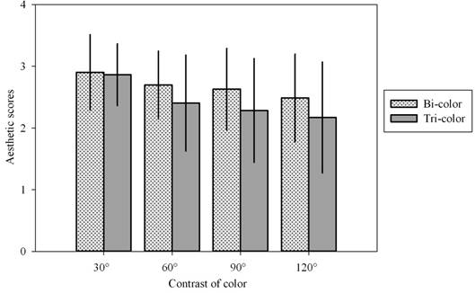
Figure 1. Mean (M) for aesthetic evaluations on color contrasts.
Table 1. T-test of aesthetic evaluations on color contrasts.
| Color numbers | Bi-color | Tri-color |
| t | P | t | P |
| Contrast (30°, 60°) | 1.584 | 0.117 | 3.152 | 0.002 |
| Contrast (60°, 90°) | 0.492 | 0.624 | 0.662 | 0.510 |
| Contrast (90°, 120°) | 0.938 | 0.351 | 0.584 | 0.561 |
| Contrast (30°, 90°) | 1.916 | 0.059 | 3.752 | 0.000 |
| Contrast (30°, 120°) | 2.809 | 0.006 | 4.269 | 0.000 |
| Contrast (60°, 120°) | 1.483 | 0.142 | 1.244 | 0.217 |
Table 2. T-test of aesthetic evaluations on bi-color and tri-color combinations.
| Color numbers | Contrast (30°) | Contrast (60°) | Contrast (90°) | Contrast (120°) |
| t | p | t | p | t | p | t | p |
| Bi-color and tri-color | 1.750 | 0.084 | 1.965 | 0.055 | 2.055 | 0.043 | 1.955 | 0.054 |
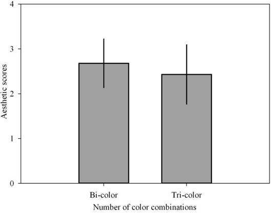
Figure 2. Mean (M) for aesthetic evaluations bi-color and tri-color combinations.
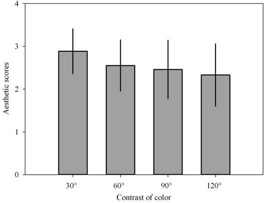
Figure 3. Mean for aesthetic evaluations from different color contrasts.
A one-way ANOVA was conducted for the number of color combination, F (1,39) =11.324, P=0.002, indicating that significant differences of scores existed among different number of color combinations (as shown in Figure 2).
There was a significant main effect of contrast, F (3,117) =19.469, P=0.000 (as shown in Figure 3). The data were further submitted to t-test, t (30°, 60°) =3.381, p<0.05; t (60°, 90°) =-0.810, p>0.05; t (90°, 120°) =1.023, p>0.05 respectively, it suggested strong difference of aesthetic scores between 30° and 60° color contrasts, other contrasts, however, no significant difference of aesthetic scores existed.
There were powerful interaction effects between the number of color combinations and contrasts, F (3,117) = 4.147, P=0.009, it demonstrated that the comprehensive effect of color number and contrast on the aesthetic evaluation of the color combination was significant.
Furthermore, the stepwise regression method was used to analyze the independent variables and the dependent variables. It can eliminate the independent variables which has no significant effect on the dependent variables. The relationship is presented by Eq. (1), where x1 is the number of color combination, x2 is color contrasts and y is aesthetic scores. The correlation coefficient is 0.315, P=0.000, so the regression model is significant.
y= 3.617 - 0.249x1 - 0.006x2 (1)
3.2. RTs Impact on Aesthetic Evaluation
Figure 4 shows that reaction times (RTs) spent by subjects increase with the color contrasts no matter in bi-color or tri-color combinations, that is, subjects needed more response time to evaluate the color combinations with the larger contrast. Nevertheless, t-test on four contrasts of same color number showed that the main effect of contrasts for RTs was not significant (Table 3). At the same time, different number of color combinations were submitted to t-test (Table 4), the results demonstrated that there was not significant main effect of the number of color combinations on RTs.
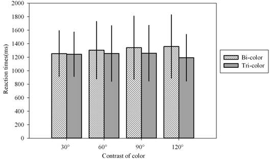
Figure 4. The RTs of color contrasts.
Table 3. T-test of RTs on color contrasts.
| Color numbers | Bi-color | Tri-color |
| t | P | t | P |
| Contrast (30°, 60°) | -0.591 | 0.556 | -0.131 | 0.896 |
| Contrast (60°, 90°) | 0.364 | 0.717 | 0.051 | 0.959 |
| Contrast (90°, 120°) | -0.165 | 0.869 | 0.794 | 0.429 |
| Contrast (30°, 90°) | 0.954 | 0.343 | 0.188 | 0.852 |
| Contrast (30°, 120°) | 1.141 | 0.258 | -0.688 | 0.493 |
| Contrast (60°, 120°) | 0.537 | 0.593 | -0.739 | 0.462 |
Table 4. T-test of RTs on bi-color and tri-color combinations.
| Color numbers | Contrast (30°) | Contrast (60°) | Contrast (90°) | Contrast (120°) |
| t | p | t | p | t | p | t | p |
| Bi-color and tri-color | 0.124 | 0.902 | 0.526 | 0.600 | 0.820 | 0.414 | 1.798 | 0.076 |
As shown in Figure 5, for RTs took by aesthetic evaluation of individual, the main effect of the number of color combinations was significant, F (1, 39) =9.965, P=0.003.
The analysis of one-way ANOVA on the color contrasts indicated that the contrast of color combination has a significant effect on aesthetic judgments of clothing, F (3,117) =19.469, P=0.000 (As shown in Figure 6). Moreover, t-test was conducted for contrast, t (30°, 60°) =3.381, p<0.05; t (60°, 90°) =-0.810, p>0.05; t (90°, 120°) =1.023, p>0.05. No significant difference among contrasts of RTs except 30° and 60° contrasts.
There was no significant interaction effects between the number of color combinations and contrasts, F (3,117) =2.631, P=0.062, it demonstrated that the comprehensive effect of color number and contrast on the aesthetic evaluation of the color combination was not significant.
As above, the stepwise regression method was used to analyze the RTs. We found RTs were not reliably correlated with number of color combinations and contrast, so there was no stepwise regression.
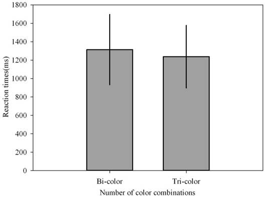
Figure 5. Mean for RTs from bi-color and tri-color combinations.
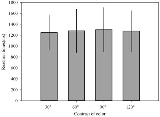
Figure 6. Mean for RTs from different color contrasts.
4. Discussions
The present study focused on investigating the influence of clothing color combination on the individual aesthetic cognition. The results revealed that the lower contrastive color combinations were more harmonious and tended to be preferred by participants. Color contrast has a direct impact on the individual’s visual code [18]. The low color contrast gives a visual balance and a feeling of harmony. Similar color combinations like bright yellow and orange present nobleness in the design of tea gift package [19]. In online clothing shops, a fashion image is more likely to be tied to lower color contrast or combinations with navy [20]. Nevertheless, the greater contrast of color combinations, the less beauty of color combinations. Color activates a series of cognitive reactions which belongs to implicit association. It would produce the startup phenomenon when it induced the psychological effects [21]. Stronger color contrast was easier to make individual excited that result in visual and mental fatigue, so the beauty of color combinations decreased. It conforms to the previous study that participants, more often than not, liked the color with similar hue or exactly match [22]. In addition, the scores rated for bi-color combinations were higher than those for tri-color combinations in each color contrast, that is, clothing with bi-color combinations were more popular with participants compared to tri-color combinations. Through the aesthetic study of clothing color combination, we can further explore the influence of clothing color matching on individual aesthetic perception, and provide a more scientific and comprehensive reference for clothing color design.
We also analyzed the date of RTs, because it has been thought as valid measure of the time it takes to carry out mental processes in behavioral measures [23]. The results indicated that the participants spent more time in making judgments for clothing with bi-color combinations than those for tri-color combinations. Generally speaking, it was more difficult for participants to make aesthetic judgments for bi-color combinations. The main reasons are: many factors need to be comprehensively considered when participants rate the clothing with bi-color combinations. In addition, a variety of color combinations which bring the aesthetic experience more neutral and difficult to judge whether beauty or ugliness, complexity is a deterrent to the aesthetics of an object [24], so RTs spent by participants increased. Whereas, the contrast for tri-color combinations was relatively large that result in low aesthetic experience, so reactions for participants tended to be very rapid. In terms of color contrast, RTs took by participants were shorter for color combinations of medium contrast compared to that for lower contrast. That is, the difficulty of making aesthetic evaluation for medium color contrasts was higher than those for lower contrasts. Remarkably, the RTs spent on tri-color combinations with the contrast of 120° declined by individual. One possible reason is that the contrast of 120° is excessively strong and complicated which is easy to result in dizzying visual effect. Therefore, participants tend to make judgments for contrast of 120°within a split second.
5. Conclusions
According to the experimental results, participants deemed that the clothing with stronger contrast of color combinations was less beautiful, namely, the participants prefer the lower color contrast of clothing. As the each stimulus presented within a split second, color is a key factor to exert sufficient influence on aesthetic evaluation. In general, colors that relatively close in the hue ring used to be comfortable and bring perfect aesthetic experience, while the color combinations with stronger contrast often bring people greater visual stimuli. The results of the experiment lead to the following findings.
The stronger the color contrast, the less beautiful the clothing it is no matter in bi-color or tri-color combinations.
Clothing with bi-color combinations is more beautiful than those for tri-color combinations.
The difficulty of making aesthetic evaluation for bi-color combinations are higher compared to that for tri-color combinations.
Acknowledgement
This work was funded by A Project Funded by the Priority Academic Program Development of Jiangsu Higher Education Institutions (PAPD).
References
- Doughty, J. C. (1968). The art of fashion color forecasting. Textile Institute & Industry, 6 (4), 97.
- Judd, D. B., Wyszecki, G. (1975). Color in Business, Science and Industry. Third Edition, John Wiley & Sons, New York.
- Huang, S. M. (2012). The rating consistency of aesthetic preferences for icon-background color combinations. Applied Ergonomics, 43 (1), 141-150.
- Schloss, K. B., Stephen, E. P. (2011). Aesthetic response to color combinations: preference, harmony, and similarity. Attention Perception & Psychophysics, 73, 551-571.
- Ou, L. C., Luo, M. R. (2006). A study of colour harmony for two-colour combinations. Color Research & Application, 31, 191-204.
- Allen, E. C., Guilford, J. P. (1936). Factors Determining the Affective Values of Color Combinations. The American Journal of Psychology, 48 (4), 643-648.
- Schloss, K. B., Stephen, E. P. (2010). Aesthetics of color combinations. Human Vision and Electronic Imaging XV.
- Reinecke, K., Yeh, T., Miratrix, L., Mardiko, R., Zhao, Y. C., Liu, J., Krzysztof, Z. G. (2013). Predicting users’ first impressions of website aesthetics with a quantification of perceived visual complexity and colorfulness. Proceedings of the SIGCHI Conference on Human Factors in Computing Systems, 2049-2058.
- Lauer, D. A., Pentak, S. (2002). Chapter 5: balance. Design Basics, 75-98.
- Brady, L., Phillips, C. (2003). Aesthetics and Usability: A Look at Color and Balance. Usability News, 5(1), 45-49.
- Yun, M. H., Hong, H. S., Kim,J.(2003).Incorporating user satisfaction into the look-and-feel of mobile phone design. Ergonomics,46, 1423-1440.
- Deng, X. Y., Hui, S. K., Hutchinson, J. W. (2010). Consumer preference for color combinations: an empirical analysis of similarity-based color relationships. Journal of Consumer Psychology,20, 476-484.
- Ma, M. Y., Chen, C. Y., Wu, F. G. (2007). A design decision-making support model for customized product color combination.Computers in Industry,58, 504-518.
- Tommaso, M. D., Sardaro, M., Livrea, P. (2008). Aesthetic value of paintings affects pain thresholds. Consciousness and Cognition,17, 1152-1162.
- Xu, Z. (2007). A relative study of aesthetic cognition and aesthetic experience’s impact on university student’s multiple happiness [D]. Southwest University.
- Jacobsen, T. I., Ricarda, R. I., Schubotz, L., Hofel, Y. C.(2006).Brain correlates of aesthetic judgment of beauty. NeuroImage,29, 276-285.
- Jiang, X. F., Cai, L. R. (2013). Evaluation of aesthetic response to clothing color combination: a behavioral and electrophysiological study. Journal of Fiber Bioengineering and Informatics,6 (4), 405-414.
- Bian, Z., Zhang, Y. W. (2015). Study of spatial reconciling in urban color planning-based on the thinking of urban color planning of Harbin, Energy. Environment and Green Building Materials-Sheng, 115-118.
- Chi, C. S. (2016). Research on the Fashion Design of Paper Stocks Tea Gift Packaging Combined with Color Design,Applied Mechanics and Materials,815, 910-913.
- Koge, Y., Murakami, T., Kurosawa, Y., Mera, K., Takezawa, T. (2015). Extraction of the Combination Rules of Colors and Derived Fashion Images Using Fashion Styling Data. Proceedings of the International MultiConference of Engineers and Computer Scientists, 1, 45-49.
- Zhou, Y. J., Xue, Q., Liu, M. X. (2015). The Effect of Color on Implicit Cognition and Cognitive Control. Proceedings of the 22nd International Conference on Industrial Engineering and Engineering Management 2015, 665-677.
- Lindgaard, G., Fernandes, G. J., Dudek, C., Brownet, J. (2006). Attention web designers: you have 50ms to make a good first impression!Behaviour and Information Technology,25, 115–126.
- Aaker, D. A., Bagozz, R. P., Carman, J. M., Maclachlan, J. M. (1980). On using response latency to measure preference.Journal of Marketing Research,17, 237–244.
- Moshagen, M., Thielschc, M. T. (2010). Facets of visual aesthetics. International Journal of Human-Computer Studies, 68, 689-709.


